1) Students will look at the breakdown of olim by country since 1948.
This link shows the numbers of olim by country and by year:
https://www.jewishvirtuallibrary.org/total-immigration-to-israel-by-country-per-year
This link shows totals by country:
https://www.jewishvirtuallibrary.org/total-immigration-to-israel-by-country-of-origin
Important notes:
- FSU stands for Former Soviet Union which includes Russia, Ukraine, and other countries
- The Mizrahi Aliyah (from the middle east) is not included in the first chart (by year)
2) Instruct students to consider the following questions while looking at the charts of olim.
- Do you see anything which you were not expecting? Why is it surprising to you?
- Look at the statistics for your country specifically – is anything there surprising to you?
- Which year or years had the largest aliyah from your country? Do you have any guesses as to why?
- Look at the statistics for some of the communities that you learned about in the Faces of Israel community profiles. Which years had the biggest aliyah from those communities? Why?
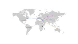
3) Instruct students to create a visual showing aliyah to Israel. We suggest taking a large map of the world, and using string or different colored lines to show the immigration of Jews from different countries to Israel. This can be done physically or using a virtual medium like canva or using google maps. Students can add in information or pictures for the different communities they are showing on the map.
Here is a rough idea of what this might look like:
These aliyah maps may be displayed around your classroom or school.